High Adventure Youth Camp Brochure
Project Scope
High Adventure Youth Camp is a sleepaway camp for children located in Laramie, Wyoming.
I was tasked to create a clear but fun brochure for parents to learn about High Adventure’s camp program. The copy for the brochure was provided by the company and I was tasked with displaying it in an 8in x 8 inch format. The design should be appealing to both children and adults while also clearly displaying the information.
Ideation
I started off the project by researching existing camp brochures or flyers. Many of the traditional brochures were trifold but I would be creating a booklet. The majority of the inspiration I found was for visual style instead of formatting.
I then began sketching. I was quite ambitious and decided to craft a logo for High Adventure day camp that resembled a national park pennant. I experimented with topographic circles you would see on a hiking map. I thought it might serve as a background for the pages. I also sketched a few different icons one might associate with camping. I knew no matter the direction I chose, I would use small pictures in some way in order to appease a child’s mind.
Three Compositions
I created three different compositions that I could possibly follow for the rest of the project. They each followed a different approach to childhood camping trips.
Composition A
In composition A, I wanted to showcase the logo I crafted for High Adventure Day Camp. I cleaned up and vectorized my sketch in Illustrator so it could be resized if needed. The background was meant to represent a sunset or sunrise that many admire while camping or hiking. I also vectorized my small icon sketches and planned to use them in this composition. The sketchy mountains are a base for what the rest of the imagery would look like. This design would be simple but spotlight the pendant logo I created.
Composition B
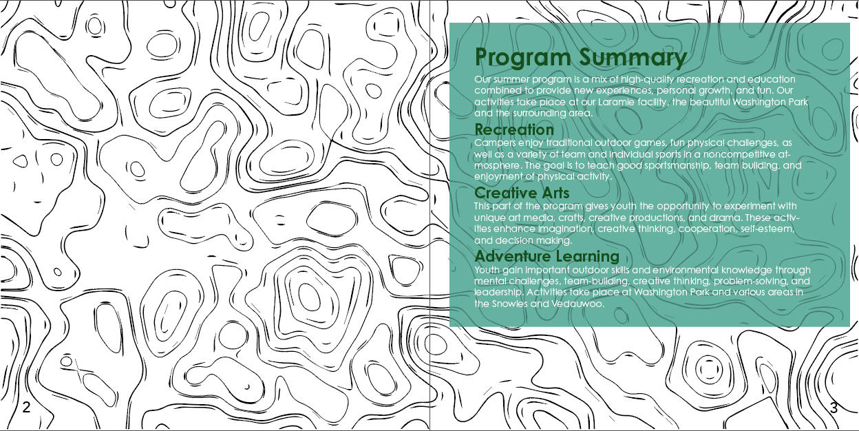
This composition is meant to replicate a topographic map that shows varying elevations. I used Photoshop to create the randomized map design. From there I want the rest of the features to resemble a map. The chosen colors were meant to represent various elements seen on a map. Here I experimented with using Century Gothic as the chosen typeface. I quickly ruled it out as I thought it was too futuristic looking for a camp brochure. I debated pursuing composition B because I was drawn to the organic shapes in the background. However, I decided against this design because of the lack of color and appeal to children.
Composition C
The third composition was the most colorful of the three with bright orange, yellows, and blue. The background resembles the sun in the sky and offers a clean and clear area for the copy to be displayed. The clouds have a grainy drop shadow that gives the whole brochure a paper cut-out look. The design resembled something the campers might make during the craft session. The cover page uses a modified version of the logo from composition A. Many of the composition’s original elements were removed because it was overcrowded and a little too child-like. This composition also inspired me to design the camp rules page the way I did. I felt the sign-like style fit the background perfectly and almost feels like you’re looking at a sign rather than looking at the paper.
Final Product
I decided to follow the paper cut-out style because it was simplistic for parents but colorful and fun for the campers. It also reminded me of paper crafts you might create when you go camping.
I tested a few typefaces for the headlines and body copy of the brochure. For the majority of the project, I was using Rockwell for headlines and Avenir for the body. The slab serif typeface reminded me of a rustic feeling one might associate with the outdoors. I paired Avenir with it because thought the chunky slab serif needed a clean sans serif to contrast it. Before submitting the final draft, I changed my mind and swapped out both the headline and body copy typeface. Gill Sans was the chosen typeface for the copy because of its legibility and fun nature. It was not completely round and geometric-like Avenir, but instead exuded a sense of fun for the children viewing the brochure. The headline was replaced with Pink Chicken, a rounded a sans serif font that resembled thick marker but wasn’t too child-like.
In the final composition the colors were muted because when the test print came out, it was almost hurting my eyes to look at. I also removed the green color from the final print and replaced it with orange and blue for the subheads.


