Tampax Pearl Package Design
Background
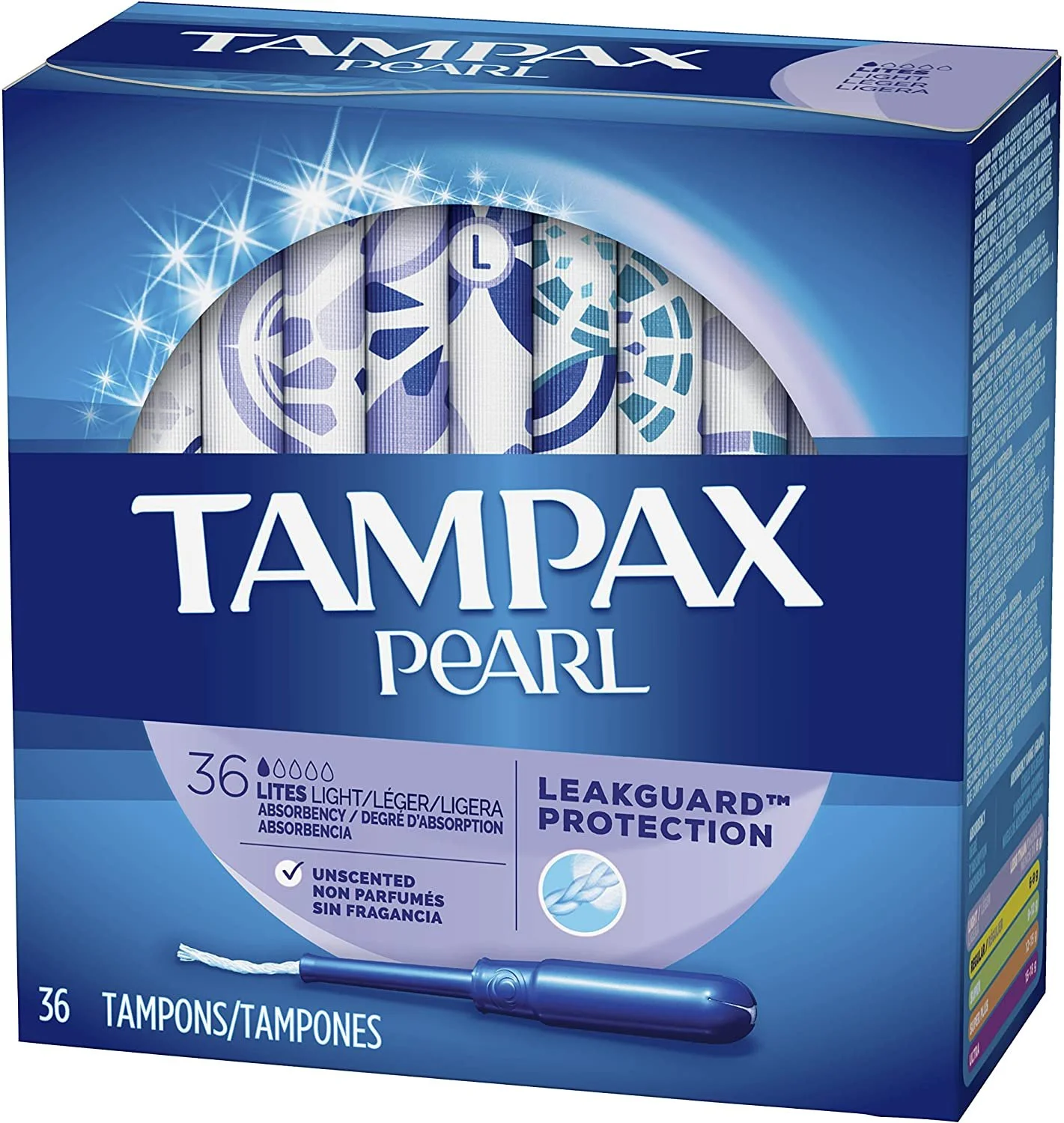
Original Tampax Pearl Package Design
For generations, tampon companies have gotten away with selling tacky and unappealing packaging to women simply because the consumers had no other choice. In 2020, 4.5 billion boxes of tampons were bought globally. Tampax accounts for 29% of those sales, making them the number one selling tampon in the world.
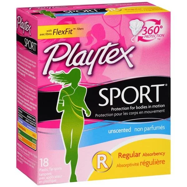
Small tampon businesses have popped up that value the customer’s needs and wants, providing organic and environmentally friendly tampons in beautiful packaging. But these companies often charge more for their product and it’s not possible for the majority of people to purchase them all the time. It’s time for mega tampon brands like Tampax, Playtex, and Kotex to have a long-overdue makeover.
Tom organice tampons
An analysis of the current most popular tampon brands showed a repetitive and overly feminine package design. Not all women like pinks, sparkles, and flowers, a regular on tampon packaging. Also, needing tampons and being a woman no longer go hand-in-hand. Times are changing and the design should be unisex and appeal to all.
Empathizing
I asked my colleagues that use tampons what they would like to see in a tampon package design. I received some helpful opinions for when I would begin designing. Many of them expressed their hatred for the bright colors that come with tampon packaging, and that includes the applicator and wrapper.
To quote one of my colleagues, “It screams ‘Hey everyone! I’ve got my period,’” The goal is to normalize tampons but it’s not possible when the package is as loud and obnoxious as it is. We don’t want to feel embarrassed pulling a tampon out of our bag but we are. Minimalistic packaging could help with the initial image the world has of tampons, making them less taboo.
Visually, I was leaning toward Kotex. The almost all-black packaging is a stark contrast to the usual pinks, swirls, and butterfly designs. However, these tampons are a fair amount more expensive than the Tampax or Playtex and don’t sell nearly as much. Many people are not willing to spend the extra few dollars every month to buy a new box, just for the packaging. While the packaging sells, there is no need for how it product looks when it gets home to the consumer. Only the functionality matters at that point. The main purpose of packaging is how it looks while the tampons are being transported.
Packaging With Character
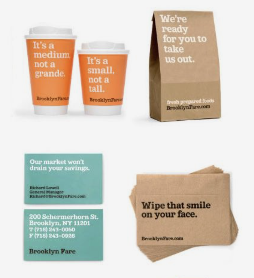
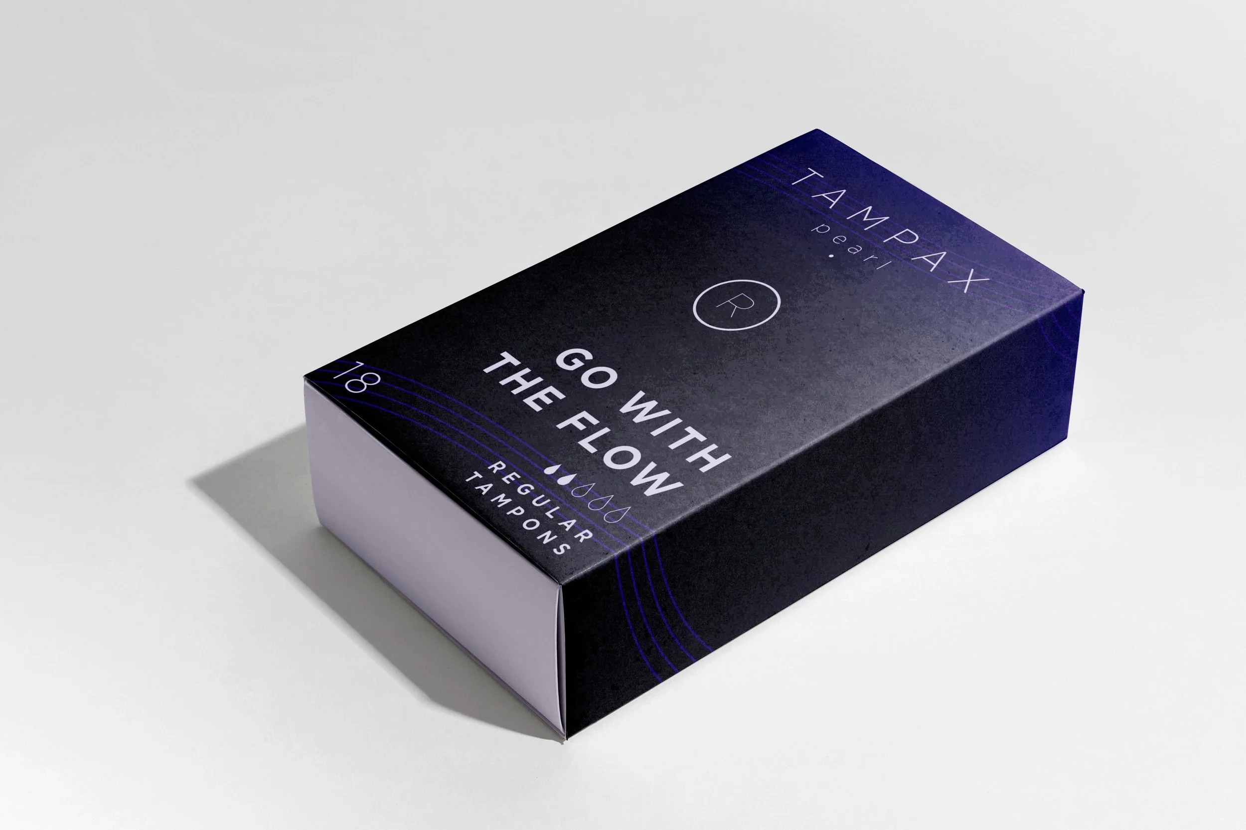
Consumers like packaging they can interact with. Cheeky messages or funny icons can brighten someone’s day just enough that they’ll want to return for more. I wanted to incorporate this idea in the tampon packaging because no one likes to be on their period but a quick laugh can make the whole process a smidge more enjoyable. I began brainstorming different phrases and puns that could be related back to menstruating. The final three I chose to include were, “I’M BLEEDING OUT.,” “GO WITH THE FLOW,” and “DON’T CRAMP MY STYLE.” Even if people don’t buy Tampax tampons, there’s a possibility of bringing a smile to their face in the store.
Typography
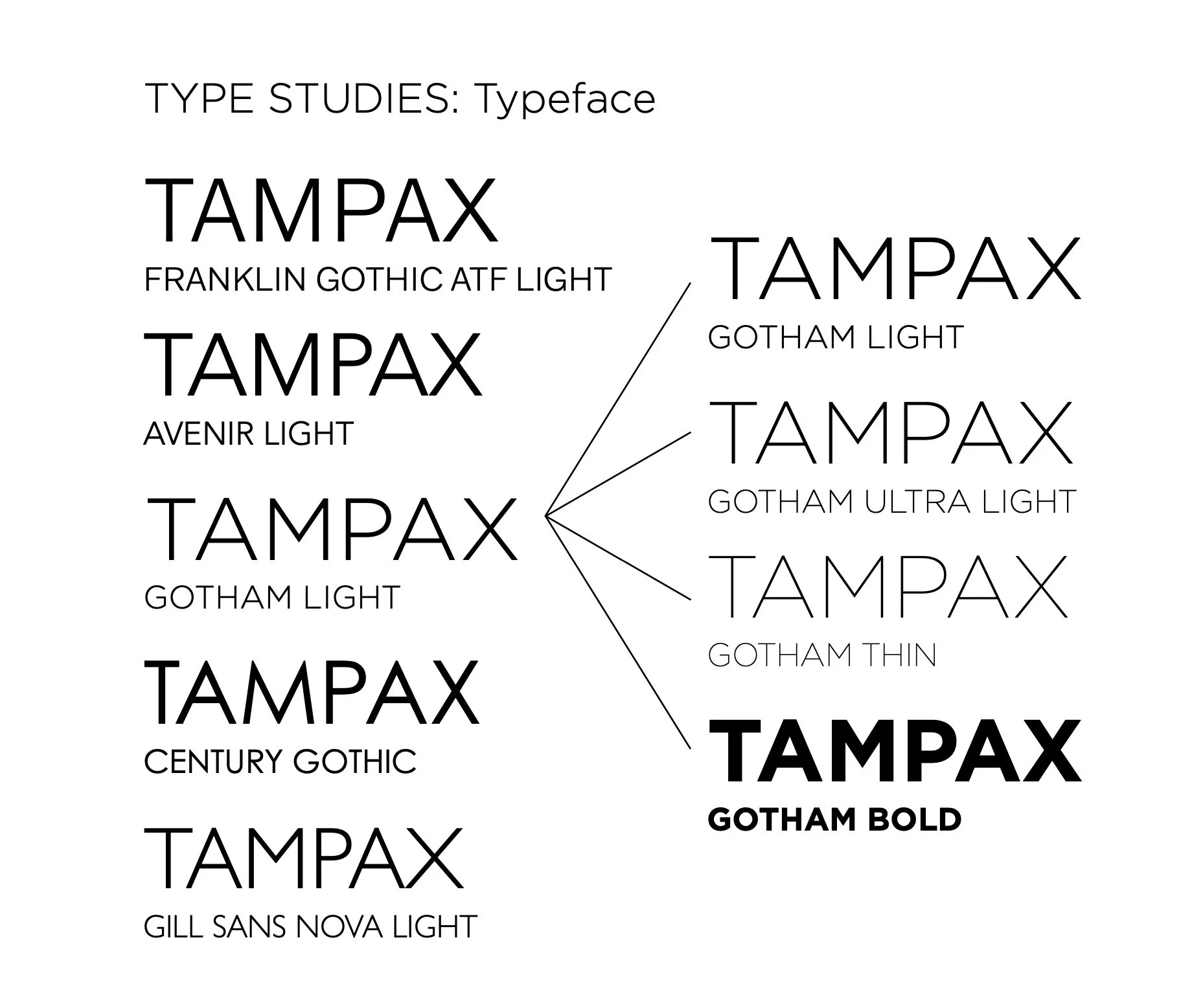
The Tampax Pearl logo would be tracked out to give it a sense of airiness and fluidity. I didn’t want to brand name to appear to sharp or boxy and spacing out the letters gave each character breathing room.
The typeface I decided on was Gotham, using mainly Light, Thin, and Bold. Gotham displayed the brand name best with the loop on the P extending far down, creating a circular look. I wanted the typeface to be as geometric as possible especially when it came to displaying the logo. Gotham is a clear and geometric typeface with a variety of weights that allowed for both small body text and large, thick headlines.
Two Compositions
Composition A
I hoped a black gradient would be a refreshing difference from what was already out there as far as tampon packaging goes. However, I received various notes of feedback that mentioned this color scheme reminded the consumer of cologne rather than tampons. When trying to make the packaging less feminine, I ended up making it overly masculine.
This composition was inspired by various condoms and lubricant packaging. The reason was not to sexualize the idea of tampons but to instead attempt to normalize it. I felt that condom packaging can be discrete but also recognizable, to the point where consumers can recognize it in an instant. It was my goal to try and minimize the obnoxious colors screaming out to everyone around you in the store. Like I mentioned, tampons and other feminine hygiene products are considered to be taboo much like condoms.
Composition B
The second composition was not as bold. The typography of the design was kept the same, but the color scheme was changed. This one consisted of monochromatic pastel packaging in various colors that represented the different sized tampons. I stayed away from pink and purple because I feared it would be feminine, much like the packaging that already exists. I chose orange, blue, and green for the three packages in this proposal.
There is not much to the background, like the previous comp, just four thin dynamic lines that traverse their way across the box. The minimalistic design is intended to help the package blend in amongst other consumer goods, making it unrecognizable to the general public without closer inspection. The only hint to what the package might be is the bold witty phrases and the well-known name brand.
Final Product
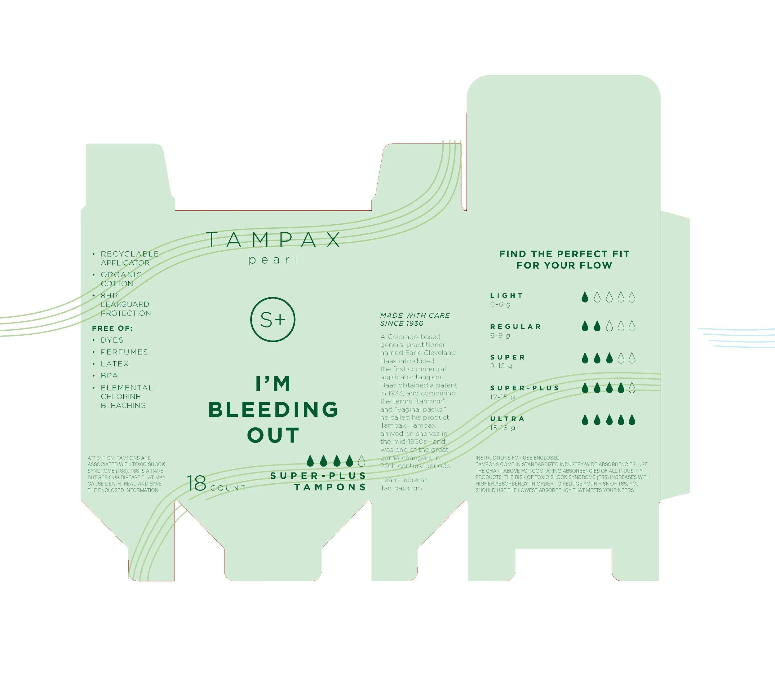
With the front of the package complete, I began figuring out where to place all the additional extra information. I looked at my owned box of Tampax Pearl super tampons and took notes of what each side of the box said. There was a size chart, a list of product perks, and the necessary warning labels and legal instructions.
The next element was the sizing chart. I knew this had to be on the backside of the package because it would take up a substantial amount of space. The original Tampax size chart uses colors to represent the different absorption levels. But this isn’t very friendly to users that might have visual impairments. I decided to use a scale to represent the different sizes on the market. For example, light tampons have only one of the teardrops filled in, letting the consumer know it has the lowest absorbency level. The new design allows users that do not speak English or have perfect vision to easily decipher the size chart.
With the additional information added to the package, the box now appeared as an inconspicuous tampon packaging with lengthy warning labels included. Consumers seeking the product would know what it is because of its location in the store and the recognizable Tampax name. With this design, aesthetic tampon packaging is possible without the added costs to consumers.
Because of the product’s purpose, tampon packaging requires a lot of pre-determined text to warn users of the possible dangers if the product is misused. This takes up a reasonable amount of space but the packaging could not be produced without it. I placed the official copy in first to make sure I would have enough room for the rest of the content.


